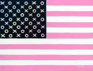
One of a trilogy of “Good and Lovely” flags in the artist’s larger and namesake “Good and Lovely” collection, this most recognizable – a recreation of a contemporary American flag – seems straightforward, until Candace Lovely turns to her creation and tells its story in layers. As many layers as stripes, the passion and point of color selection, and which colors are placed against each other and why, are almost as nuanced is the ideals the image represents.
In Good and Plenty America, “the stripes wobble against the hard line of the secondary color – their opposite – softening the edge, captured in the thin outline or rainbow hues bordering each pink stripe adding, a vibration of the primary color.”
Lovely points out her directorial intention in the ombre progression “from the center where the red is, going out, that draws the eye to say, ‘look here first then look around.’ The warmest area is in the center, and the red goes out into the rainbow,” she says painting a word picture about the intended melting pot of the nation.
Poetry and Science
“A society of different colors of the rainbow loving each other,” is pulled together on a canvas, with the personal passion of the artist hidden in literal familiar symbols of love. Lovely submits that the heart of this piece, “is hidden in the sentiment behind the xs and os, or kisses and hugs, representing the culmination of the true goodness of the United States of America.”
To understand the context as well as the symbolism, the viewer must first step back and take in the collection as a whole: Each piece in the collection marries the color palette of the Good & Plenty™ candy brand with a “feel good” approach to paintings and subjects alike. “Good and Lovely” was created to span a variety of imagery and settings the artist considers, “some of the biggest attractors or attractions” presented “in black and white (because opposites attract) with a medium hue of pink.”
 The medium (central, mix, middle) hue is a medium (a tool, method, vehicle) – something by which the artist pulls two variant sides together, maintaining, even showcasing their differences yet working as the prismatic ombudsman, melting opposites into a fluid, honeyed blend.
In all the “Good and Lovely” paintings, pink is the officiant at the marriage of black and white.
Throughout the collection, Candace Lovely stays consistent in both theme and palette – painting in colors that pair off against one another from their polar positions as she then intentionally, lovingly introduces a third to bring them together – the attracter. She completes this intention by selecting evocative visuals – iconic personalities, evocative symbols, controversial elements, things that make us feel something.
Not just “something,” but what attractions make us feel – pulled in, intrigued, flush, connected. Things that make us feel love – for a place, for others, for something that captures our attention much less heart. Attractions quite simply – whether in life or in this enigmatic collection by an evocative and emotionally inspired classic artist – make us feel “Good and Lovely.”
About the Collection:
“Candace Lovely’s Good and Lovely collection was born of a 2001 gallery show featuring ‘the element of attraction, where each painting tells a story in black and white, with a medium hue of pink,’ according to Lovely. The idea and palette were inspired when she was painting one of her many ‘fair women on the shore’ paintings and noticed the combination of the model’s dark hair, black ribbons on a white dress, black dog, and the pink of the umbrella. ‘It reminded me of Good & Plenty™️ candies and how their bright colors made you feel’ (considering the candies themselves, the colors on the box, and the era that incorporated these colors into pop culture).”